- Website
Year
2024
Our Contributions
- User Research
- Competitor Analysis
- UI Design
A Conceptual Design for an Advertising & Creative Agency
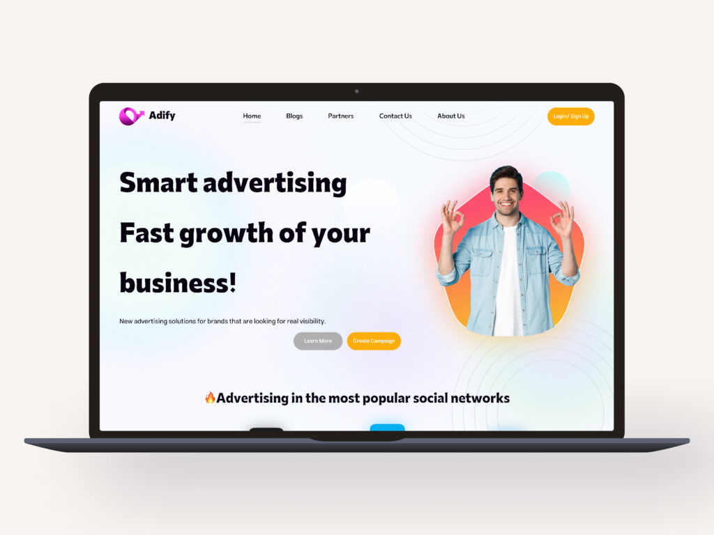
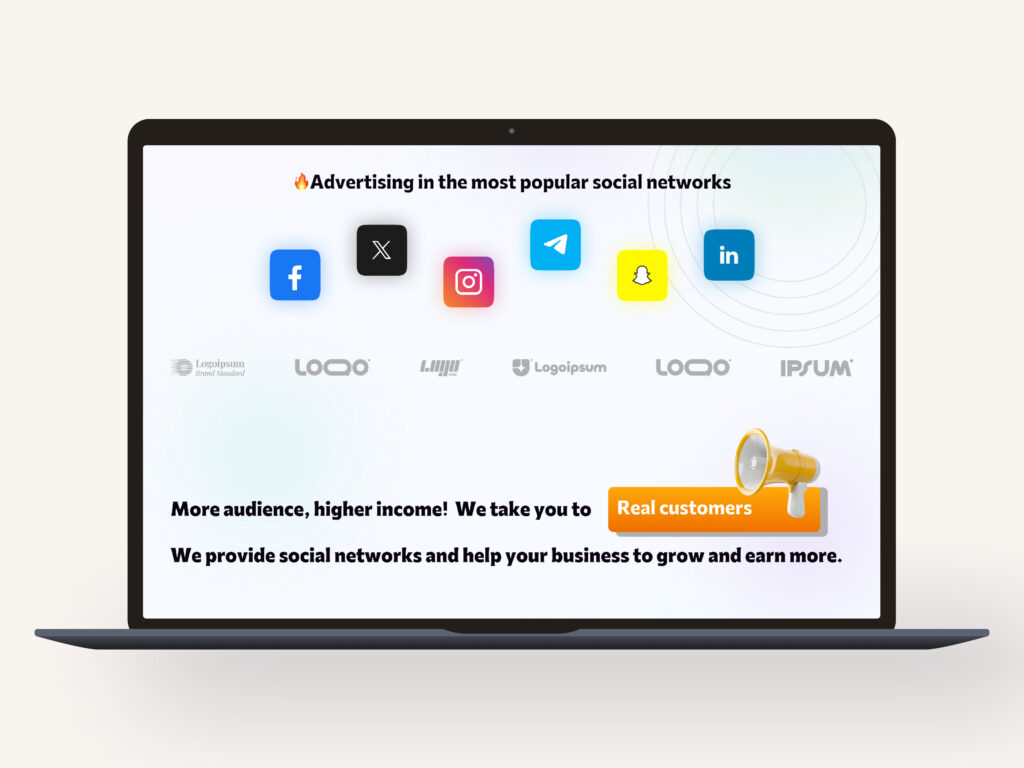
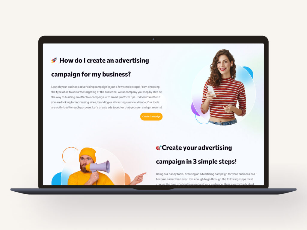
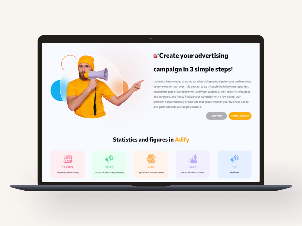
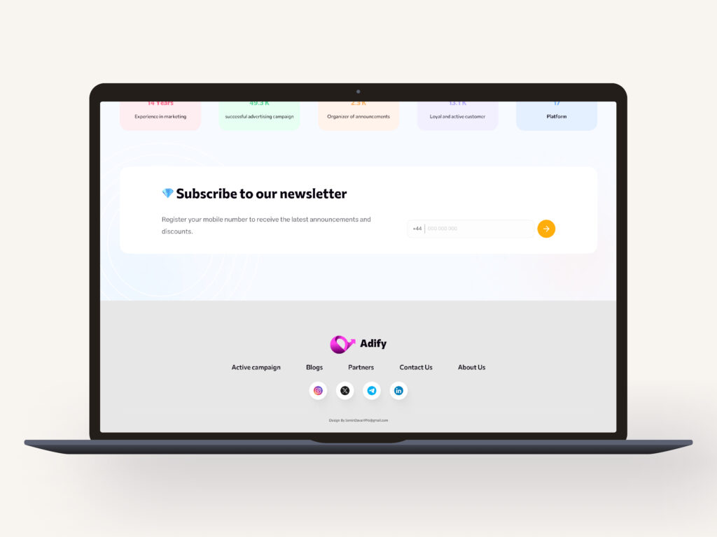
In this project, my goal was to create a modern and minimal website for an advertising agency that thrives on creativity and innovation. The concept design is built around bold typography, a dynamic color palette, and a modular layout to deliver an engaging and user-friendly experience. From UI/UX principles to visual identity, every element in this project is crafted to seamlessly convey the brand’s message and provide a smooth, inspiring journey for users.
Color & material
In designing the LMS platform, the color palette was chosen to create a dynamic, inspiring, and user-friendly environment. The primary bright orange color symbolizes energy, creativity, and continuous learning. It’s used for key elements like CTA buttons and interactive highlights to encourage user engagement.
Neutral tones for backgrounds and darker shades for text provide visual balance and enhance readability. This contrast ensures important elements stand out without overwhelming the interface.
The color choices were made with accessibility in mind, ensuring enough contrast for users with different visual needs. This vibrant palette not only adds liveliness to the design but also boosts motivation and interaction throughout the learning experience.
Primary Color
#FFAD0A
Secondary Color
#AFAFB0
What We Delivered
In each project, we focused on user needs and business goals, driving the design process from ideation to final implementation. Our workflow included research, wireframing, color and typography selection, and crafting optimized pages for a seamless and engaging experience. We aimed to deliver creative solutions, building practical and scalable products that bring the best results for both users and clients.
