2024
Our Contributions
- Competitor Analysis
- UI Kit Design
- User Flow Design
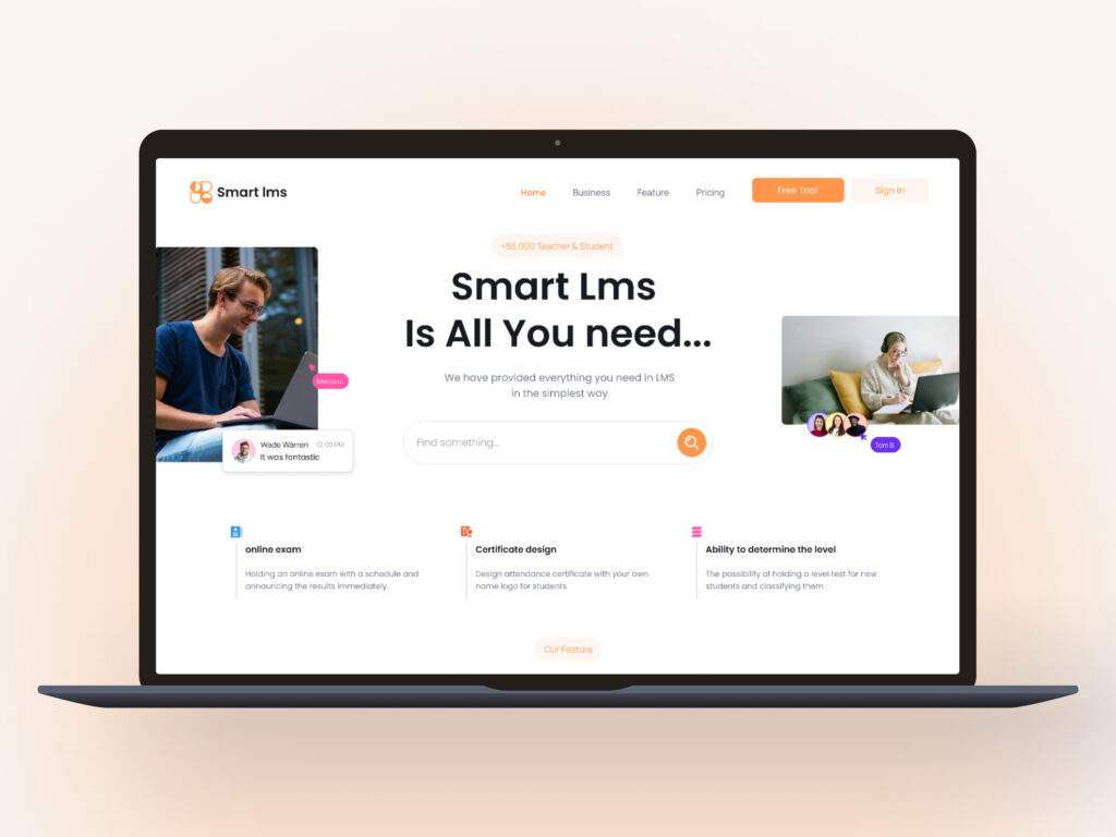
Designed for Better Learning
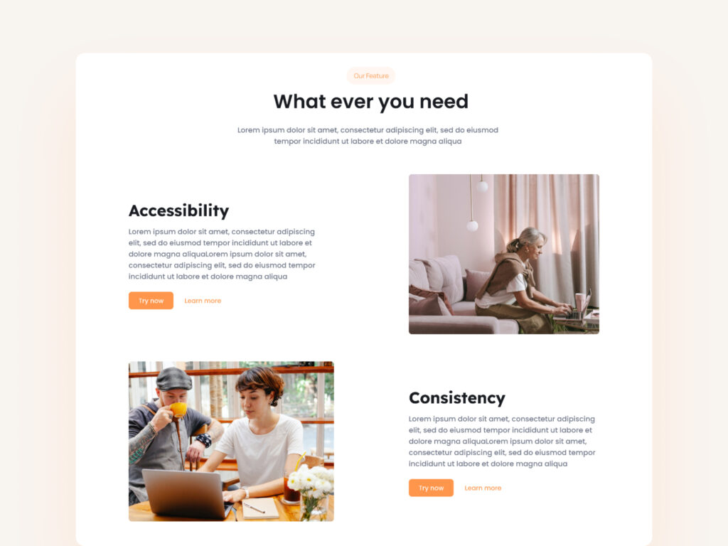
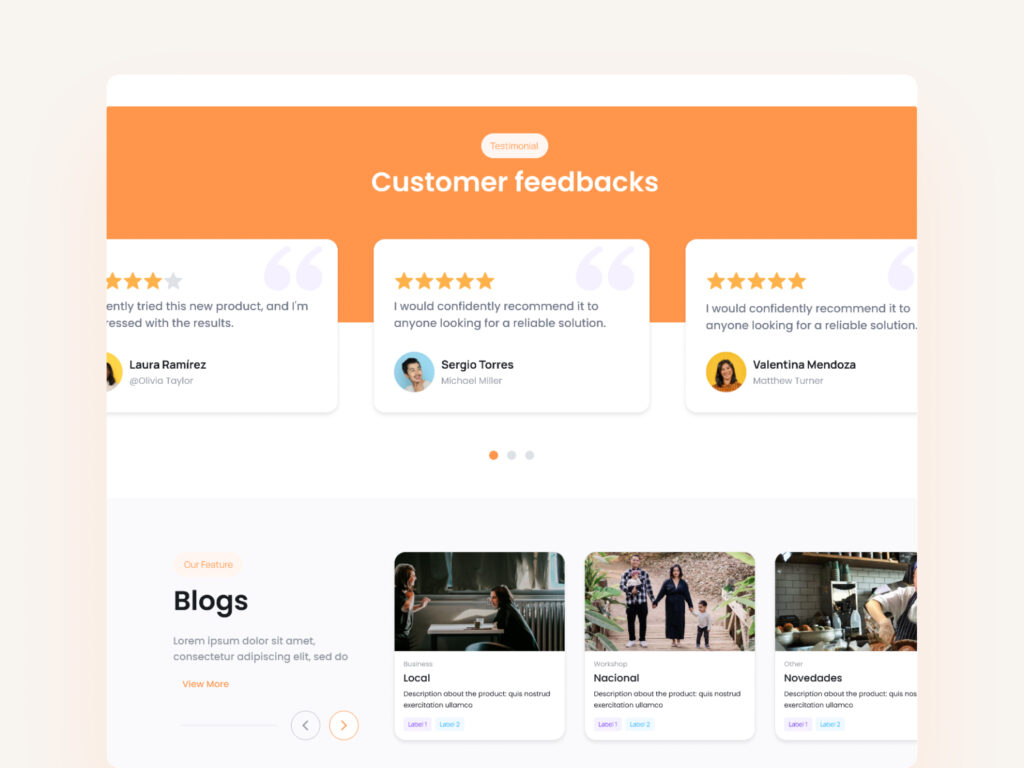
Many existing LMS platforms have a complex user experience that confuses users and makes accessing educational content difficult. This concept aims to provide a smooth and efficient experience by implementing simple navigation, quick access to courses, direct interaction with instructors, and a user-friendly dashboard for tracking progress. Additionally, personalized learning paths and a smart reminder system help keep users engaged, guiding them through their learning journey without frustration or confusion.
Color & material
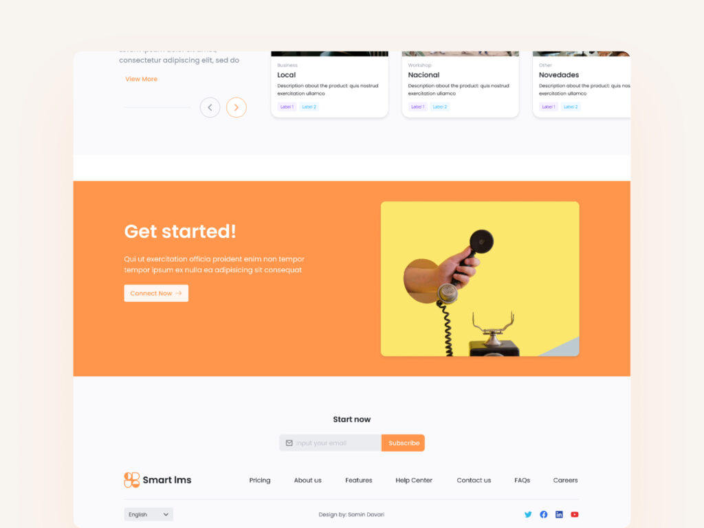
In designing the LMS platform, the color palette was chosen to create a dynamic, inspiring, and user-friendly environment. The primary bright orange color symbolizes energy, creativity, and continuous learning. It’s used for key elements like CTA buttons and interactive highlights to encourage user engagement.
Neutral tones for backgrounds and darker shades for text provide visual balance and enhance readability. This contrast ensures important elements stand out without overwhelming the interface.
The color choices were made with accessibility in mind, ensuring enough contrast for users with different visual needs. This vibrant palette not only adds liveliness to the design but also boosts motivation and interaction throughout the learning experience.
Primary Color
#FF964C
Secondary Color
#6F7787
Natural Color
#BDC1CA


