Intro
This project showcases the complete UI/UX design of a modern interior design and cabinetry website, crafted to reflect the brand’s refined, minimal, and premium aesthetic. The goal was to create a clean and intuitive experience that helps users explore services, view product collections, and understand the company’s process effortlessly.
Careful attention was given to visual hierarchy, spacing, and photography-led storytelling to ensure the interface feels warm, inviting, and professional. From responsive layouts to clear content structure, every detail was designed to guide users smoothly and build trust through clarity, consistency, and elegant simplicity.
Services
UX Research
UI Design
AI-Assisted Visual Selection
Clients
Australian Company
Color Palette & Visual Tone
The color palette for this project was designed to create a calm, modern, and trustworthy identity. A balanced mix of neutral and warm tones enhances readability while conveying a sense of quality and structure. Each color plays a defined role in the visual hierarchy, working together to form a cohesive and user-friendly interface. This palette serves as the foundation for a clean and consistent design experience.
Primary Color
#49111C
Secondary Color
#E6CCB2
Natural Color
#8F959A
01
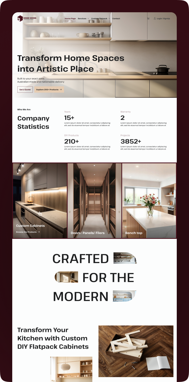
Home page
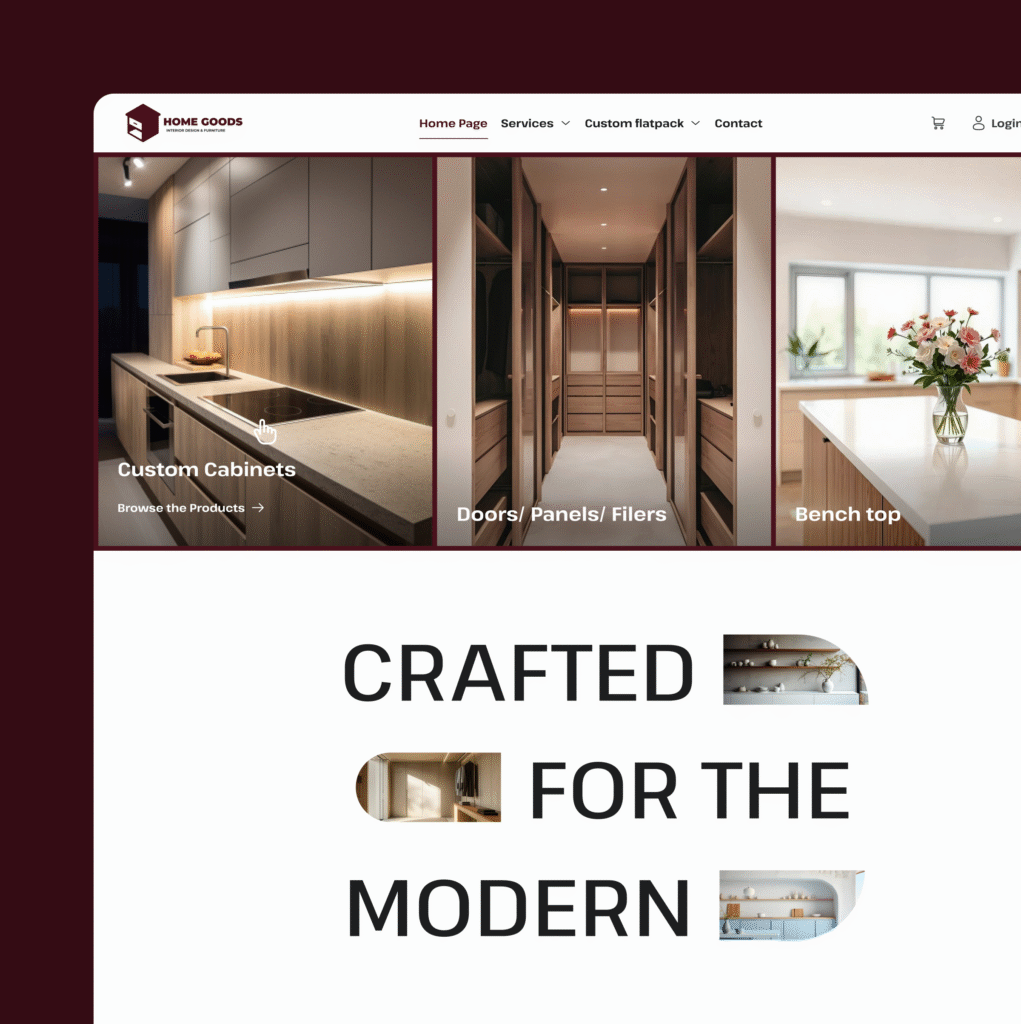
The homepage is designed to give users a clear and welcoming introduction to the brand’s custom cabinetry and home-storage solutions. A clean layout highlights key product categories and showcases craftsmanship through high-quality visuals. Strategic call-to-actions guide users toward exploring services, browsing collections, and requesting quotes. The structure focuses on clarity, trust, and smooth navigation, ensuring users can quickly find what they need. Overall, the homepage creates a warm and modern first impression that reflects the brand’s identity.
02
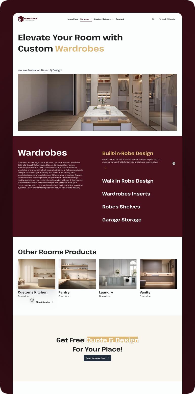
Service Page
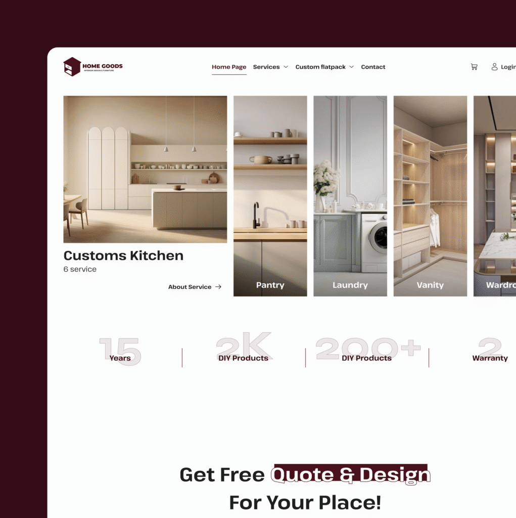
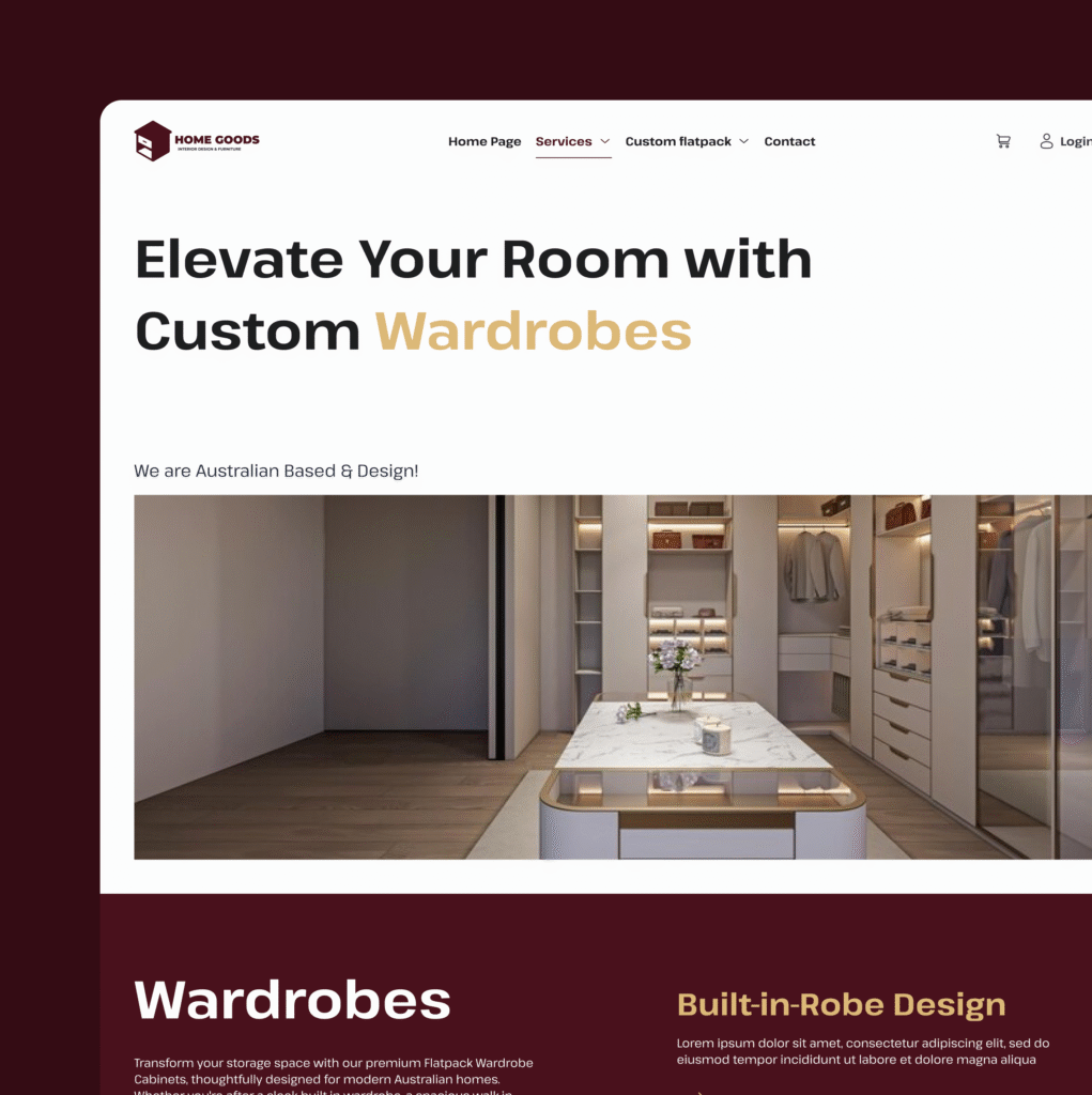
The service page is designed to give users a clear and structured overview of the brand’s custom cabinetry categories. Each section highlights a specific product type with a clean layout, guiding users through essential details without overwhelming them. Visual hierarchy, refined typography, and warm product imagery help create an intuitive flow that supports quick comparison and informed decision-making. This page focuses on clarity and discoverability, ensuring users can easily explore options and move seamlessly toward requesting quotes or viewing related products.
- Project Gallery
Visual Showcase
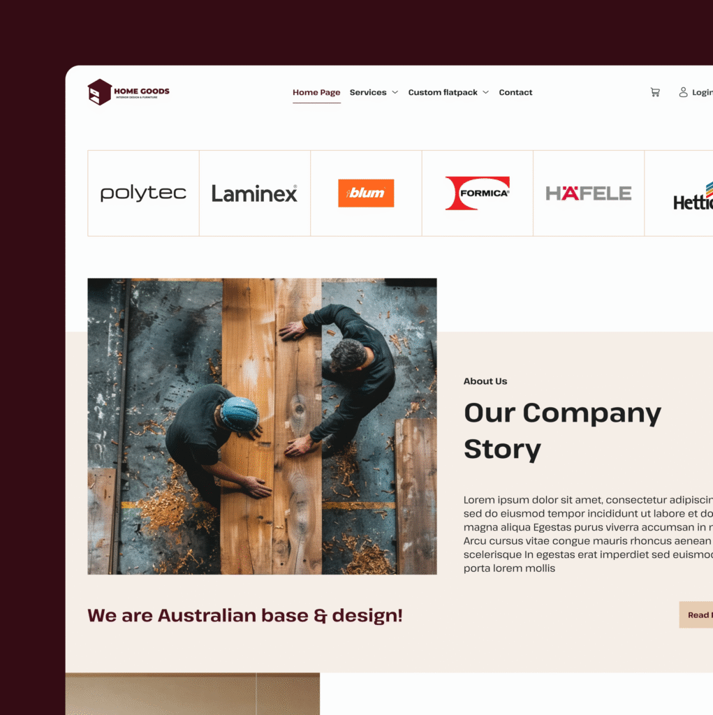
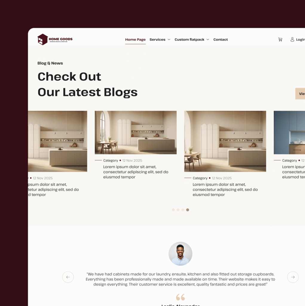
This section highlights key visuals from the project, showcasing the overall design structure and aesthetic direction. Each image represents an essential part of the UI, from layout composition to detailed interface elements. The visual gallery provides a clear look into the final outcome, emphasizing usability, clarity, and a unified design language. These visuals reflect the craftsmanship and consistency behind the project’s design.

