Intro
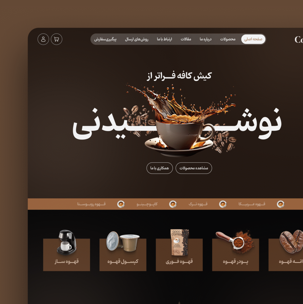
This project explores a warm and cozy visual direction inspired by the rich tones of coffee. The entire UI uses deep browns, soft gradients, and subtle highlights to recreate the feeling of a modern coffee shop. The goal was to design an interface that feels comforting, premium, and product-focused — bringing the aroma, warmth, and personality of coffee into the digital experience.
Services
UX Research
UI Design
AI-based Image Generation
Clients
Kish Coffee
Color Palette & Visual Tone
The color palette is built around the natural warmth of coffee — from deep espresso tones to soft latte shades. These colors help shape a cozy and premium visual atmosphere, reflecting both the richness of the products and the personality of the brand. The palette enhances readability, strengthens hierarchy, and creates a sense of comfort that guides users through the interface effortlessly.
Primary Color
#543622
Secondary Color
#AD8265
Natural Color
#070708
01
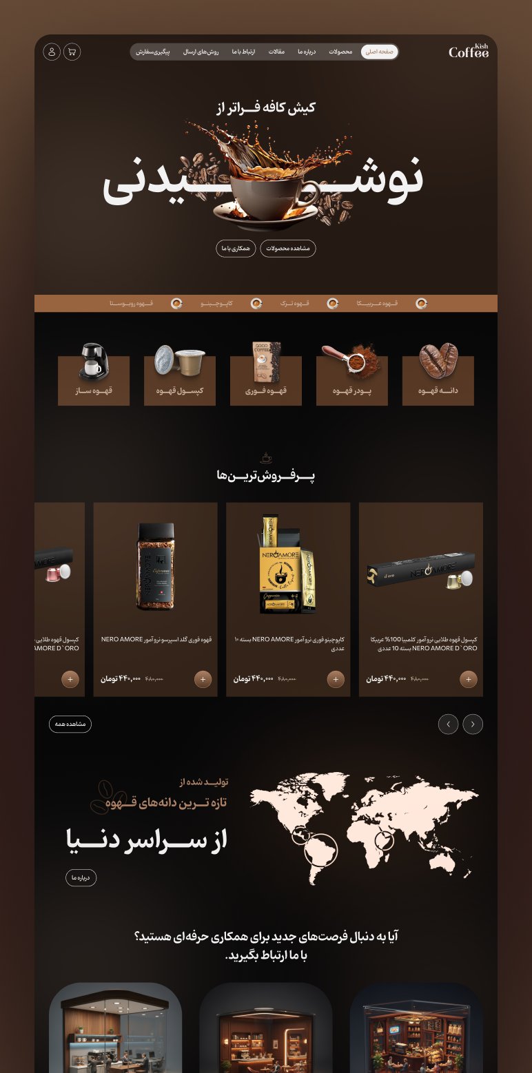
Designing a Smooth & Flavorful Homepage Experience
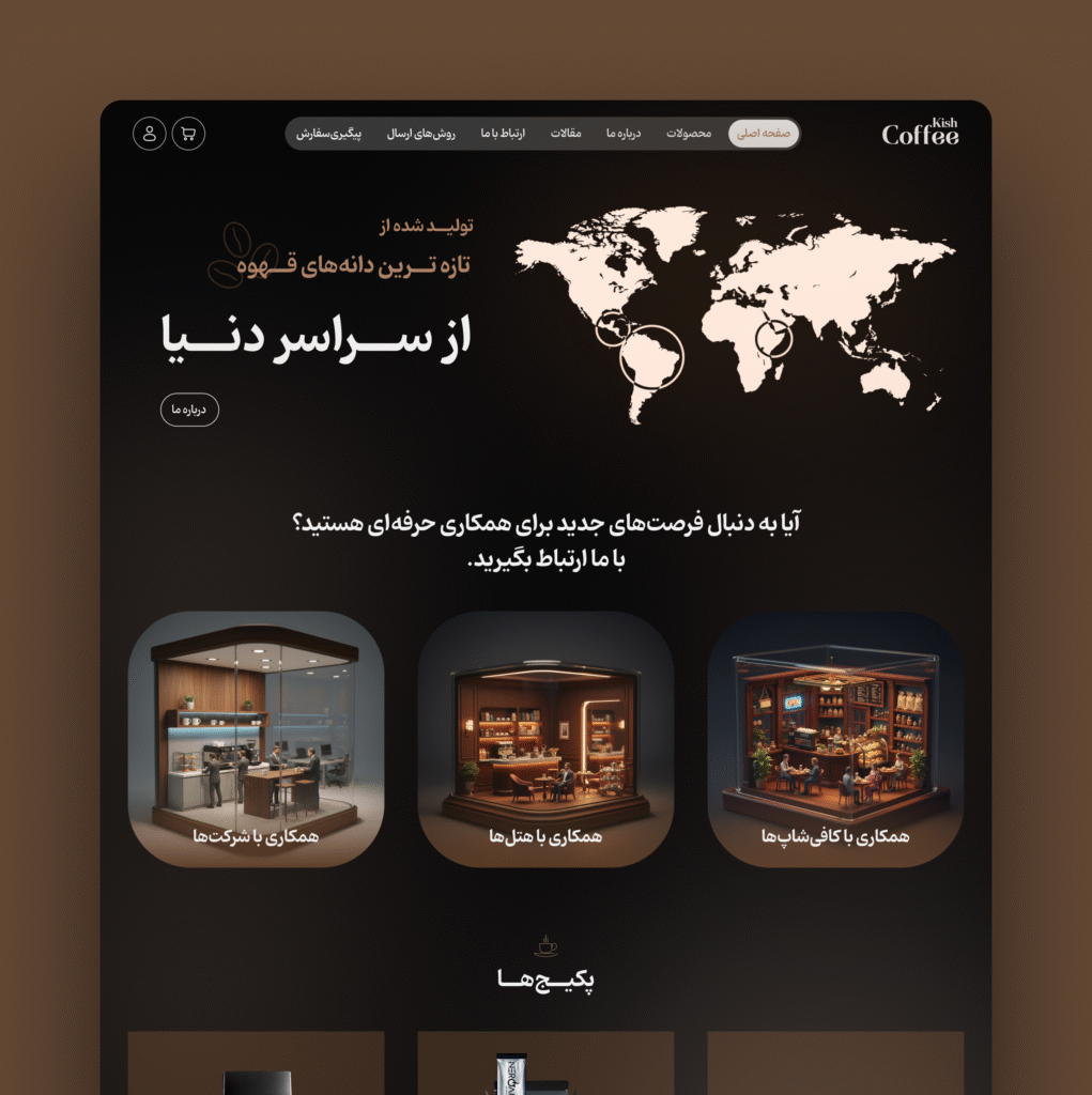
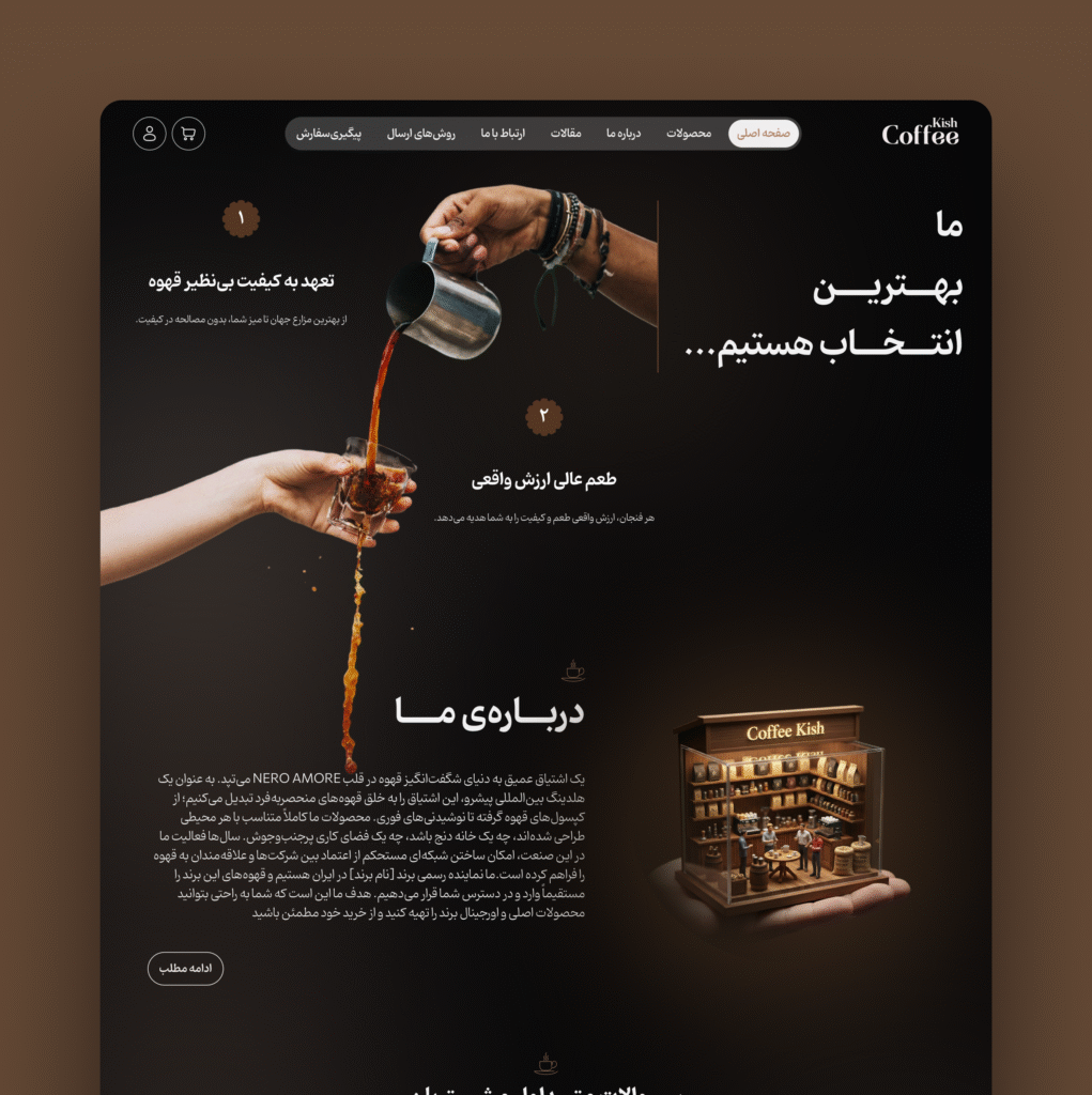
The homepage was crafted to balance aesthetics with clarity, highlighting products through clean layouts and warm visual storytelling.
A modular grid allows users to quickly scan categories, best-sellers, and brand information.
Soft shadows and rounded elements enhance the cozy, premium feel of the brand.
Navigation is simplified to reduce friction and help users reach products faster.
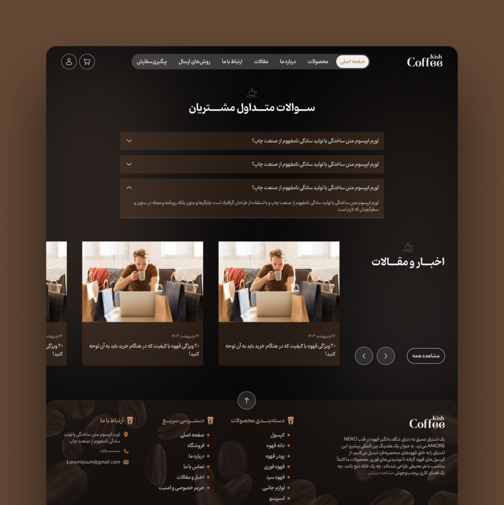
Each section guides the user through a smooth journey from exploration to purchase.
The final result is a homepage that feels intuitive, warm, and deeply connected to the world of coffee.
02
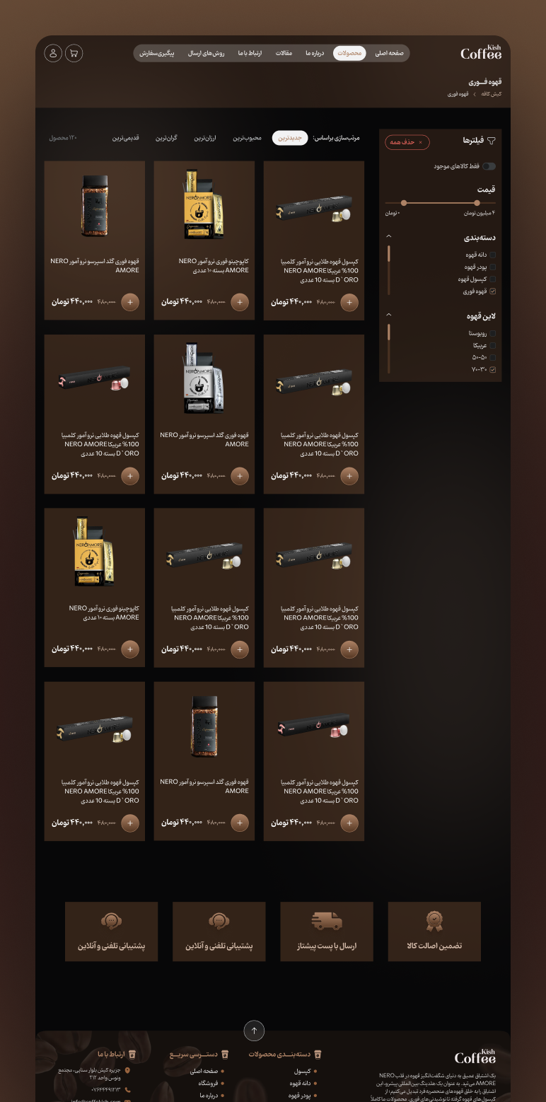
Crafting a Seamless Product Browsing Experience
This product listing page was designed to offer a clear, intuitive, and visually warm shopping experience aligned with the coffee brand’s cozy identity. The layout presents products in a clean grid, complemented by a soft, coffee inspired color palette that keeps the interface comfortable and easy on the eyes. A refined filtering system helps users quickly narrow down categories, price ranges, and coffee types without cognitive overload. The balance between visual hierarchy, spacing, and subtle shadows ensures the content feels premium yet accessible. The goal was to make product discovery smooth, efficient, and inviting.
03
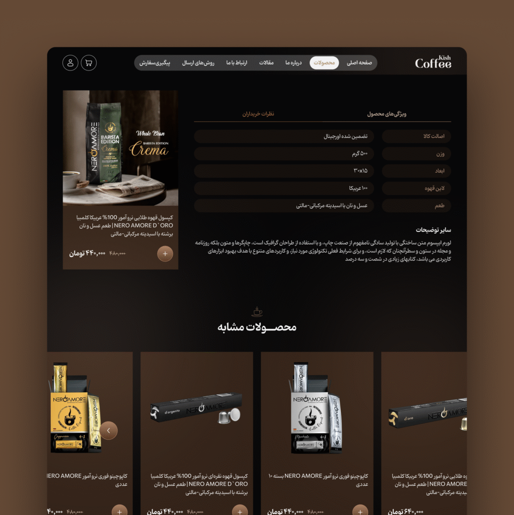
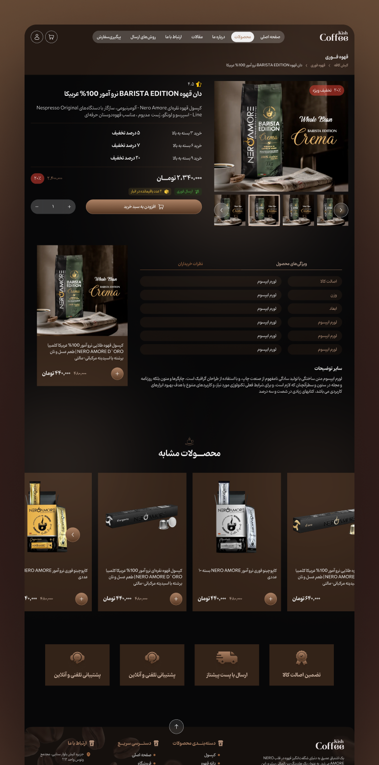
A Product Page Built for Clarity & Conversion
The product detail page focuses on presenting essential information with clarity while maintaining a warm, premium aesthetic. Large imagery highlights product quality, while structured content blocks details, pricing, features, and specifications guide users through a smooth decision making flow. The color scheme and typography follow the brand’s cozy visual language, creating a unified experience across the store. Clear CTAs, clean spacing, and readable micro-interactions improve usability and encourage engagement. The result is a detail page that feels both welcoming and conversion-focused.
- Project Gallery
Visual Showcase
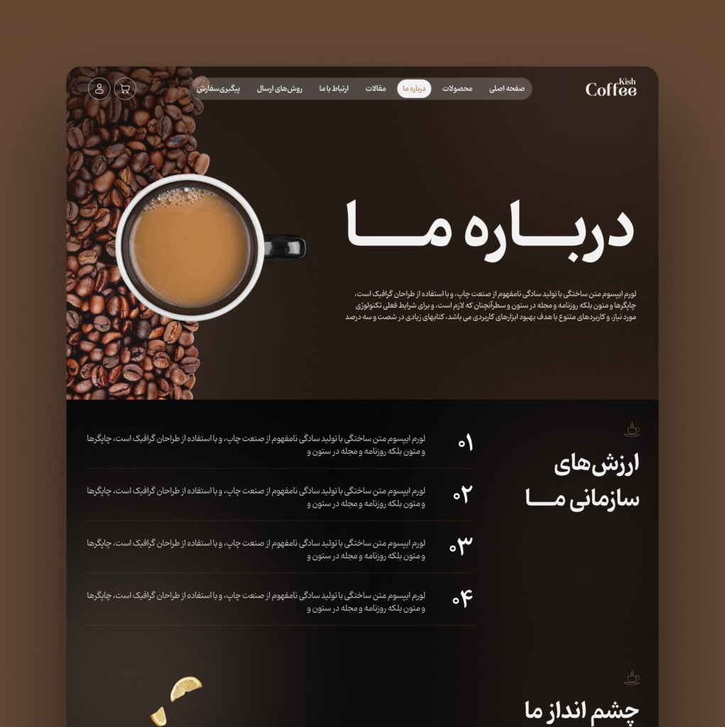
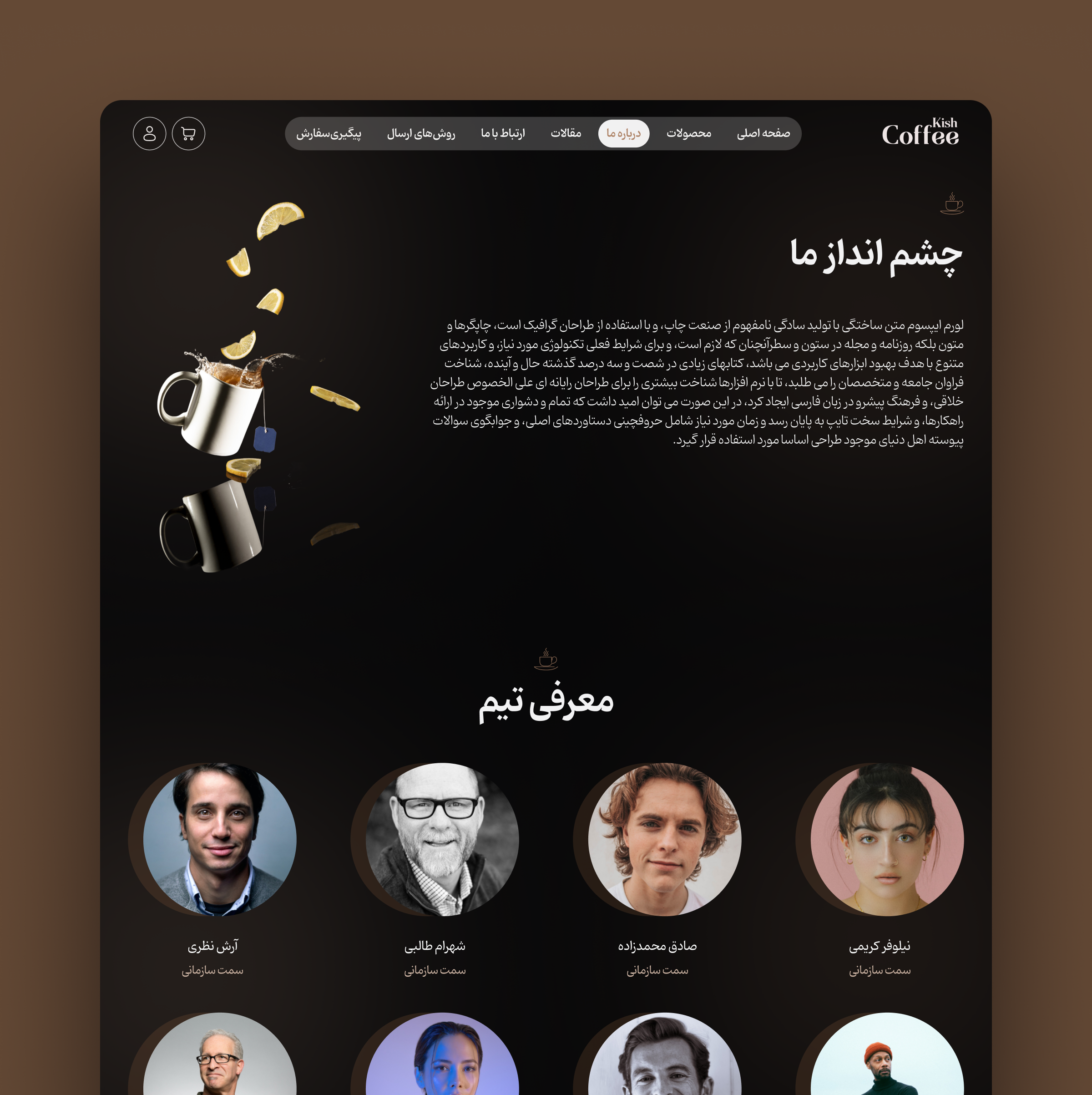
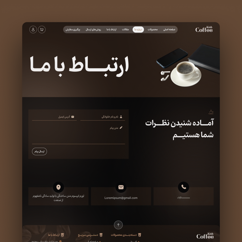
This gallery showcases a curated selection of the project’s final screens, capturing the warm tones, clean structure, and product focused layout of the design. Each visual highlights how the interface blends aesthetics with usability, creating a cohesive and inviting experience. Both desktop and mobile perspectives are included to provide a complete overview of the user journey. Together, these images reflect a cozy, premium, and coffee inspired brand identity.

