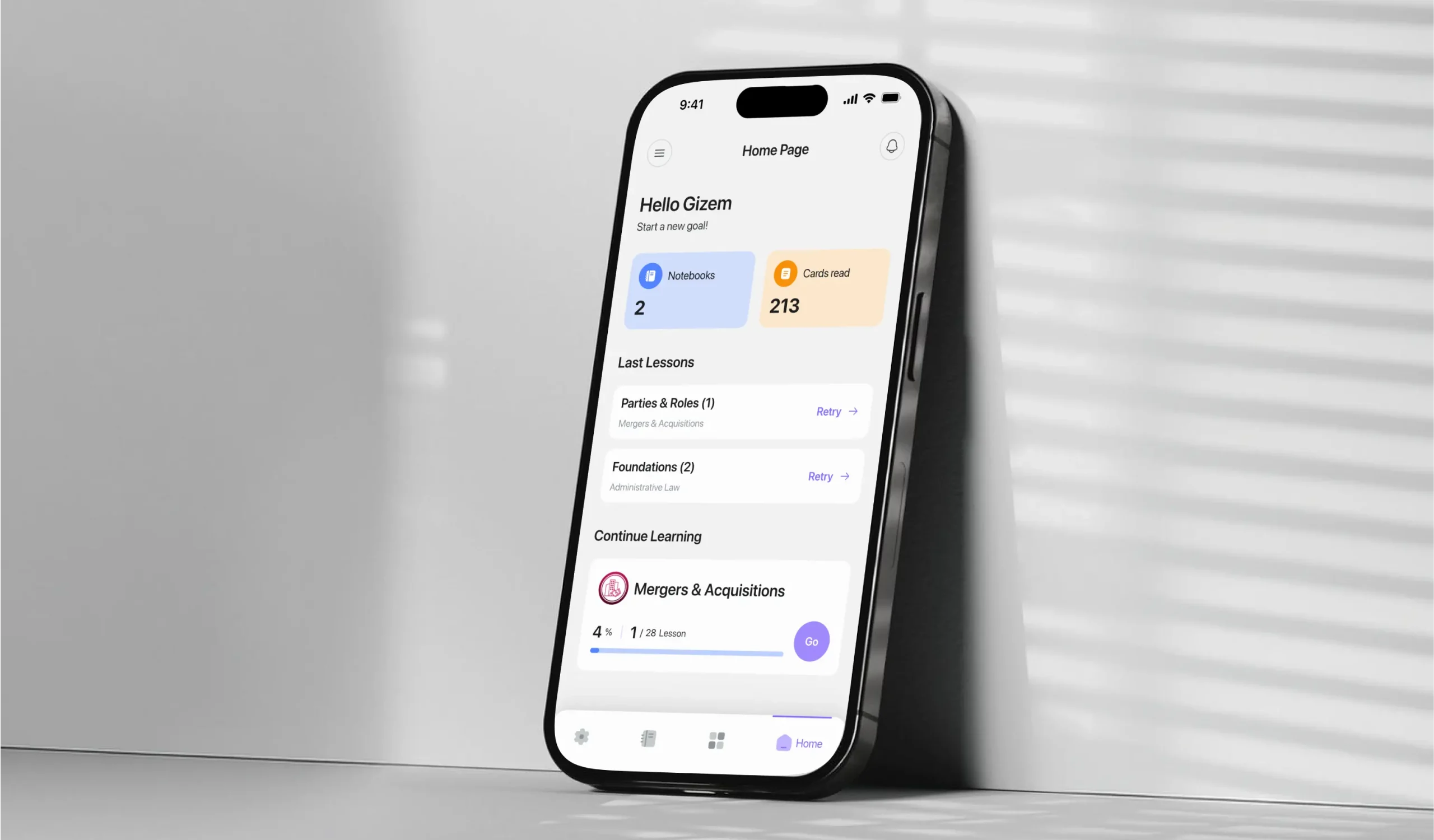
Lexi Law

Legal English learning app

Lexilaw Hero Section Image

Project Overview

LexiLaw is a mobile learning application designed to help law students build and practice their Legal English vocabulary through structured lessons, interactive learning activities, and progress tracking.


The product combines legal vocabulary with different learning methods, including flashcards, quizzes, matching activities, favorites, and review, to turn complex legal terminology into a structured learning experience.


But the challenge wasn't simply putting legal terms into a mobile application.


The real challenge was defining how users should move from discovering a legal term to actually learning, practicing, and remembering it.


I designed LexiLaw from the ground up, from defining the product structure and learning model to designing the information architecture, user flows, interaction patterns, visual system, and final mobile interfaces.

Figma
chatgpt-icon
claude-ai-icon

Project Info

Project Type

Mobile learning application for Legal English education.

Project Scope

End-to-end product design from product definition and learning architecture to UX/UI and final interface design.

Category

EdTech · Language Learning · Legal Education

My Role

Product Designer / UX/UI Designer
Responsible for product structure, information architecture, learning experience, user flows, interaction design, UI design, design system, and prototyping.

Platform

iOS / Android

Timeline

3 Month

Define Project

Defining the Learning Architecture

At first glance, LexiLaw could look like a simple vocabulary application.
A collection of legal terms./ A definition./ A flashcard. /A quiz.
But the actual learning experience is more complex. A learner may need to:

1- Explore different branches of law
2- Choose a specific lesson
3- Learn unfamiliar terminology
4- Practice recalling new terms
5- Test their understanding
6- Identify mistakes
7- Review difficult vocabulary
8- Track their progress
9- Return and continue learning

A learner may need to:

This created an important product-design question:

How do you turn a large and complex body of Legal English into a simple, structured learning experience?

The solution started by defining the learning system before designing individual screens.

User Journey

The Overall Experience
Was Designed Around 5 Main Stages:

01

Discoverability

Can students easily find the content they need?

Cognitive Load

How many decisions does the product ask the learner to make?

01

Learning Feedback

Does the product explain what the learner should do after an activity?

Progress

Does progress represent activity or actual learning?

Sub Title

Continuity

Does each session naturally lead into the next one?

The Core Learning Loop

Discover
Learn
Practice
Review
Progress
Continue

This loop became the foundation for the product architecture and the main learning flows.

01

Discovering Legal Topics

Legal English is not one large collection of unrelated words.

Terms belong to different legal domains and contexts.

I therefore structured the learning experience around

Branches of Law → Lessons → Learning Content.

This gives users a clear hierarchy when entering the product.

 
Branch

A high-level legal category.

 
Lesson

A focused group of related terminology.

 
Term

The individual piece of knowledge the learner needs to understand and remember.

The hierarchy helps transform a large amount of content into smaller, more manageable learning units.

02

Learning Legal Vocabulary

Once a lesson is selected, users enter a focused learning experience.


The goal was to make each learning session feel simple:

See → Understand → Recall → Continue

The interface gives the legal term the primary visual focus while supporting information remains accessible without overwhelming the learner.


The learning experience can include:

1: Legal term

2: Meaning

3: Translation

4: Pronunciation

5: Supporting information

6: Learning progress


The design intentionally reduces unnecessary decisions during a learning session.

03

Practicing What You Learned

Understanding a definition is only the first step.

Users also need to actively recall what they have learned.


I designed practice experiences around different interaction patterns, including:

 
Flashcards

For focused repetition and recall.

 
Multiple-choice quizzes

For testing recognition and understanding.

 
Matching activities

For creating faster connections between terms and meanings.

The goal was to make practice feel like a natural continuation of learning rather than a separate feature.

04

Learning From Mistakes

A quiz result shouldn't be the end of a learning session.

An incorrect answer provides information about what the learner may need to review.


I therefore designed the experience around:

Mistake → Review → Practice → Improvement

This principle connects the quiz experience back to the learning system.


Instead of treating mistakes as failure states, the product can use them as signals for what should be practiced again.

05

Tracking Learning Progress

Progress needed to communicate more than how often someone uses the application.


The experience was designed around different signals of learning activity, including:

- Lessons completed

- Learning activity

- Quiz performance

- Reviewed terms

- Saved content

Branch-level progress


The broader goal was to help users understand:

Where am I in my learning journey?


rather than simply:

How much time have I spent in the app?
06

Saving & Revisiting Terms

Learning doesn't always happen in one session.

Users may encounter a legal term they want to return to later.

I designed the Notebook experience as a personal layer on top of the structured learning content.


Users can save important terms, organize their personal learning material, and return to it when needed.


The experience follows three principles:

Capture quickly

Don't interrupt the learning flow.


Organize simply

Keep personal content easy to manage.


Return easily

Make saved content useful beyond the original session.

Product Model

Designing One Learning Experience
Around Multiple Systems
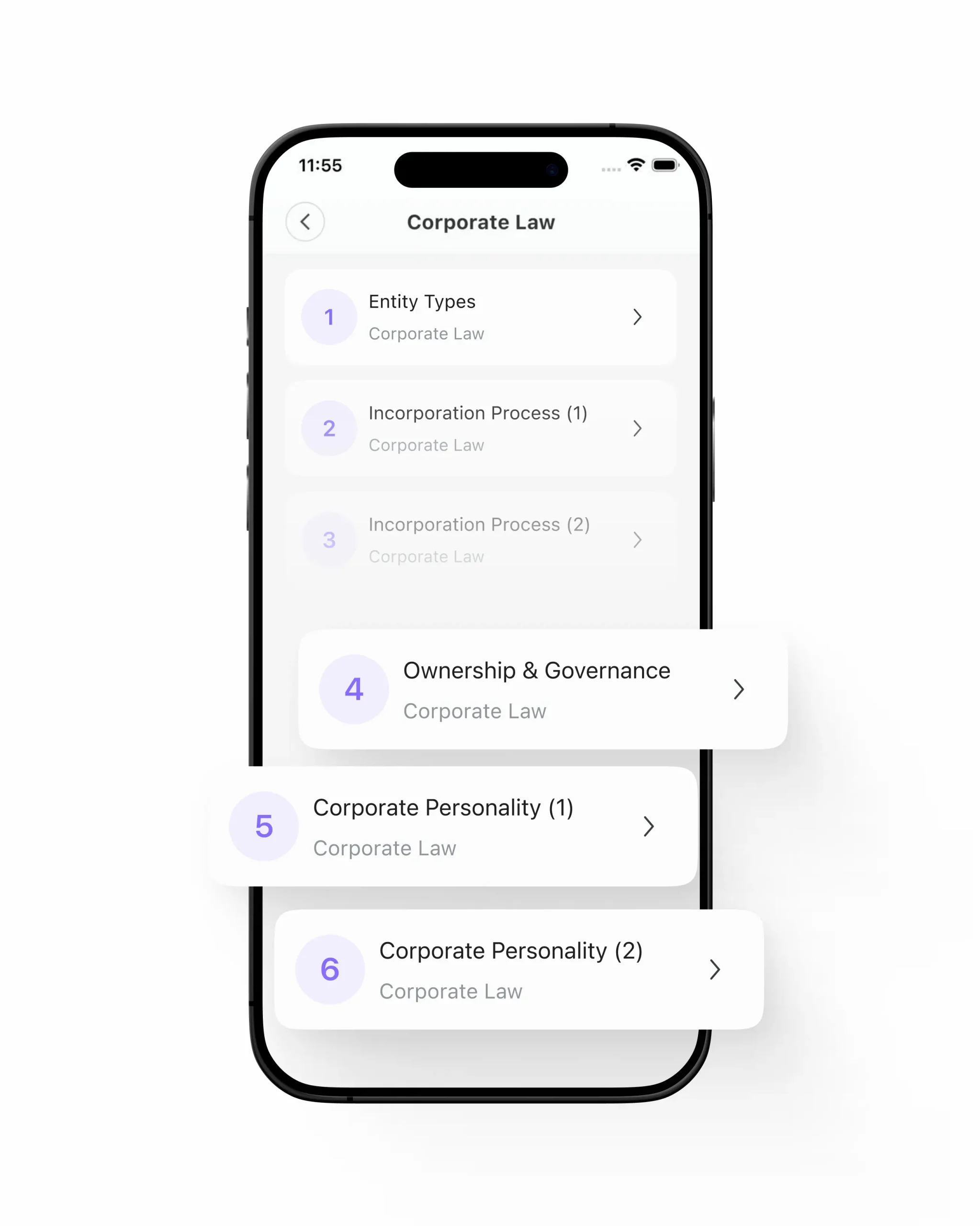
The biggest design challenge wasn't creating a flashcard, a quiz screen, or a progress component individually. It was defining how all of these parts should work together. LexiLaw combines several different systems:

01 — Legal Content Branches, lessons, and terminology create the knowledge structure.
02 — Learning Flashcards and learning sessions introduce new concepts.
03 — Practice Quizzes and interactive activities reinforce knowledge.
04 — Review Mistakes and saved terms create opportunities to revisit content.
05 — Progress Learning activity gives users visibility into their journey.
These systems needed to feel like one product rather than five disconnected features.
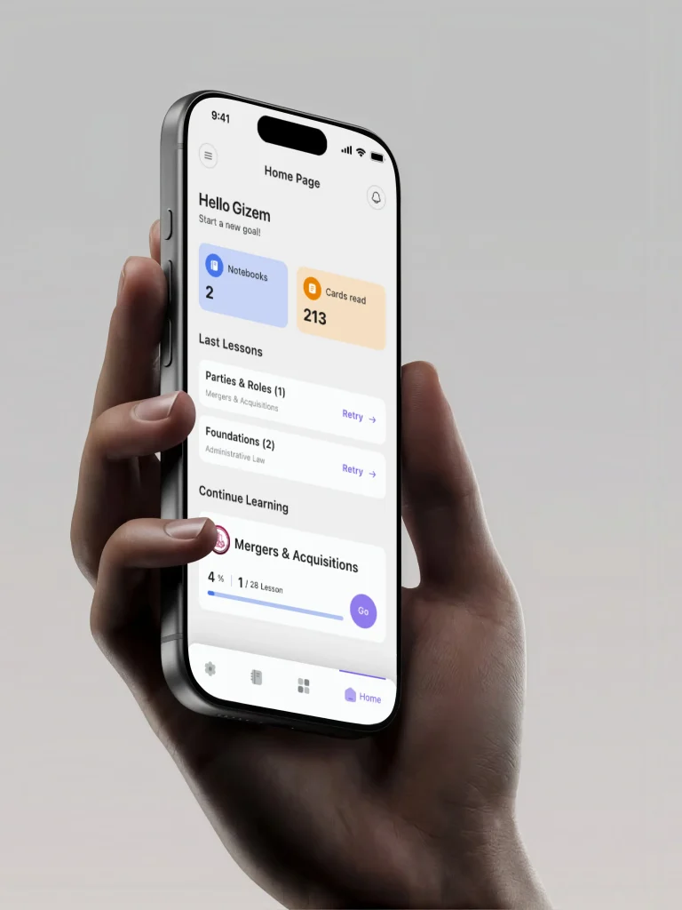
Open Application
Key Insight

Law Students & Legal English Learners

image

image

The primary audience is learners who need to develop confidence with English legal terminology alongside their legal studies.
Their needs are not limited to finding

definitions.They may need to:

1- Discover relevant legal terminology

2- Understand unfamiliar words quickly

3- Practice new vocabulary

4- Test their recall

5- Identify difficult terms

6- Review mistakes

7- Organize important terms

8- Build consistent learning habits

9- Understand their progress


This meant the product needed to support both short learning sessions and long-term learning continuity.

How Can a Complex Subject
Feel Simple to Learn?

Three challenges shaped the product experience:

image

Complexity

Legal terminology is specialized and can quickly become overwhelming when presented as a large content library.

01
image

Retention

Reading and recognizing a definition does not necessarily mean the learner can recall it later.

02
image

Continuity

The product needs to make it easy for users to understand where they are and continue learning without starting from scratch each time.

03
image

These challenges influenced the product architecture, learning flows, and interface design.

Decision

The Key Product Decision
Content vs. Learning Activity

One of the most important decisions was separating the content structure from the way users learn that content. A legal term is content. A flashcard, quiz, matching activity, or review session is a learning interaction.
This distinction allowed the same knowledge to be used across multiple experiences.

For example:
Legal Term -> Learn -> Flashcard -> Practice -> Quiz -> Review -> Mistake Review

This created a more flexible foundation for the product as new learning experiences are introduced.

Device

A device represents physical hardware.
Therefore, device-specific functionality includes:
- Power
- Manual lighting
- R-GB/RGBW
- Presets
- Custom presets
- Sunrise & Sunset
- Schedules

Aquarium

An aquarium represents the environment being maintained.

Therefore, aquarium-level functionality includes:
- Connected devices
- Aquarium information
- Tasks
- Reminders
- Maintenance activities

Information Architecture

The product structure was designed around four primary areas:

Home

The user's starting point for continuing and discovering learning activities.

Learning

The main content hierarchy:

Branches → Lessons → Learning Activities

Notebooks

A personal space for saved terms and notes.

Settings

Account & application preferences.

My Role

I Worked on LexiLaw
as a Product / UX/UI Designer

I approached the project from the product and system level, rather than starting with individual screens.

he process began with defining:
1- What the product needs to help users accomplish
2- How legal content should be structured
3- How learning activities should connect
4- Where different types of information should live
5- How users move through a learning session
6- How progress should be represented
7- How the visual system should support the experience

From there, I translated the product requirements into information architecture, user flows, interaction patterns, and the final UI.

From there, I translated the product requirements into a structured information architecture and a set of user flows before moving into detailed UI design.

Scope

What I Owned End-to-End

01

Product & Learning Definition

I defined the overall product structure and learning model, turning legal vocabulary into a connected learning experience.

01

Information Architecture

I structured the relationships between:
Branches → Lessons → Terms → Activities → Review → Progress
This became the foundation for navigation and content hierarchy throughout the application.

01

User Flows

I designed the core journeys for: Account entry / Branch selection / Lesson selection / Learning sessions / Flashcards / Quizzes / Matching activities / Results / Mistake review / Notebook management / Progress tracking / Continue learning

01

Learning Experience

I designed the interaction model for the core learning activities, including:
Flashcards / Learning sessions/ Multiple-choice quizzes/ Matching activities/ Results/ Review states
The goal was to make learning interactions focused, predictable, and easy to continue.

01

Progress Experience

I designed how learning activity and progress are communicated throughout the product.
This included:
Lesson progress / Branch progress / Activity completion / Quiz results / Review states / Learning history

01

Notebook Experience

I designed the personal organization layer for saved terms and notes.
This included:
Creating notebooks / Adding content / Viewing saved terms / Editing / Deleting / Returning to saved content

Outcomes

From a Lighting Controller to a Connected Aquarium Ecosystem

The core outcome of Aqua Sun was not simply a more convenient way to control a light. It was the creation of a scalable product model connecting:
USER / AQUARIUM / DEVICES / LIGHTING / AUTOMATION
independent from the hardware. This architecture allowed the product to grow from a simple connected-lighting experience into a broader aquarium management ecosystem. The final experience brings together physical hardware, mobile control, lighting customization, automation, aquarium organization and maintenance in one product.

If you're reading this as a hiring manager or reviewer

The thing I'd want you to take from this case study isn't a specific screen — it's the discipline of going one level beneath the interface before designing it, and being willing to say where that discipline still fell short. Happy to walk through any of the flows above in more depth, including the parts I didn't get fully right.