Application
Liom
Period Tracker
Project Overview
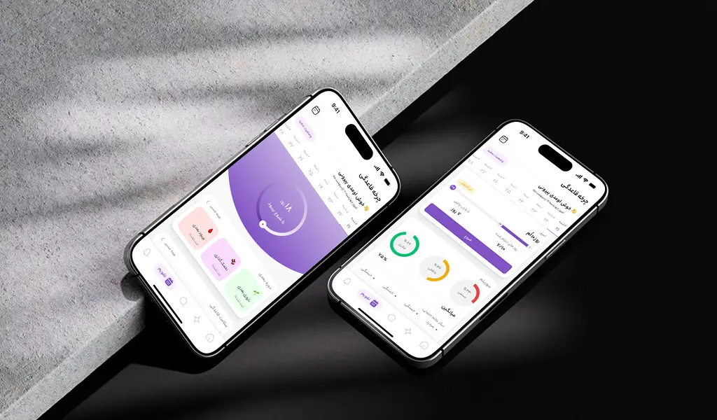
Liom is a period tracking application redesigned to serve a more mature audience. The project focused on shifting the core persona from teenagers to women aged 23+, increasing premium subscription value, and encouraging continuous engagement throughout the entire cycle. The UX approach emphasized improved flow, accessibility, and meaningful features beyond period days.
Project Type
Mobile Application
My Role
UI/UX Designer
Timeline
1 Year
What I Had Done on this Project :
User Research
01
Finding Problems
02
Redesign
03
New Feature Development
04
UI/UX Challenges
After user-research we faced 3 major problems that severely impacted the business plan:
01
Persona misalignment
The previous version primarily targeted users aged 12–15. Its visual language, content tone, and features did not align with the needs of adult women.
02
Period Limit Engagement
User engagement was limited to days close to menstruation, resulting in low continuous interaction.
03
Fragmented trip planning tools
Additionally, the premium model lacked perceived value and clear differentiation.
How I Solved Challenges
01
Experience & Information Architecture Redefined
Mature, minimal visual redesign
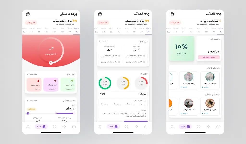
Reorganized home screen focused on cycle insights
Simplified symptom logging (Quick Log Flow)
02
Engagement Beyond Period Days
To increase daily interaction, new tools were introduced:
Daily biorhythm tracking
Personalized period assistant
Do’s & Don’ts based on hormonal phase
Mood pattern analysis
03
Premium Strategy
Strategic limitation of advanced insights to Premium
Contextual, non-intrusive subscription banners
Locked data previews to increase perceived value
04
Redesign Risk Management
Retained familiar interaction patterns
Gradual visual evolution instead of radical change
Usability prioritized over visual novelty
Final Design
The final design delivers a more mature, structured, and insight-driven experience. Users now return not only to log their period but to receive daily guidance. The redesign balances simplicity, clarity, and premium value perception.
Outcome
- Increased daily engagement
- Improved premium value perception
- Stronger alignment with the new persona
- Reduced usage dependency on period days only
This project demonstrates that in health applications, effective design goes beyond aesthetics it builds continuous value, trust, and long-term engagement.